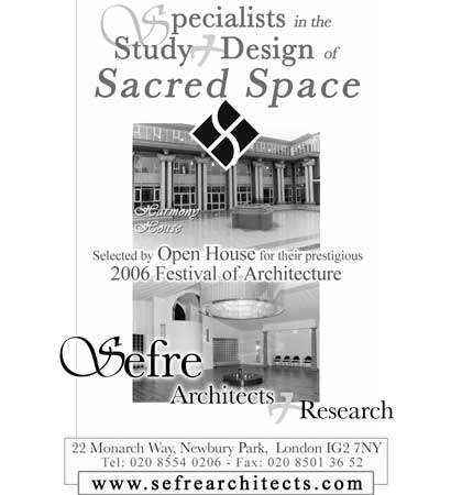
Newspaper Advert
- click to see further examples
We were approached by Sefre Architects, to create a distinctive advert design for placement in a local newspaper.
Specialising in sacred space architecture design, this gave us quite a few interesting angles to take the design. At first we played with an 'S' symbol, pushing and pulling it in a way which would connect with the sacred space themes behind the business.
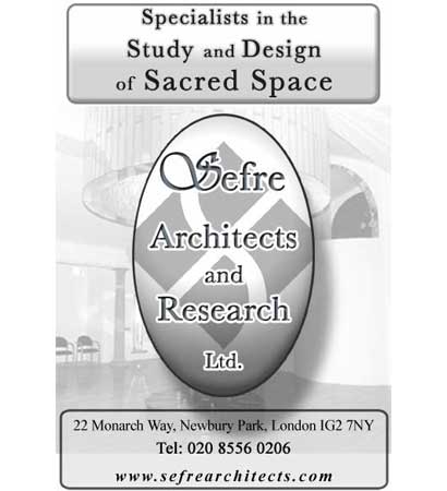
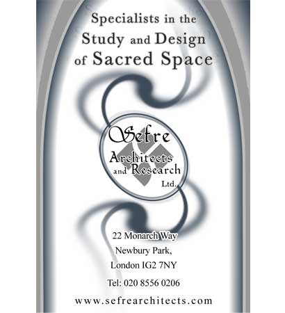
We were next given an egg shape to work with, as this had an acknowledged meaning for the type of architecture done by the firm. The final design represents a mix of all the above processes and ideas.